
From Soup Cans to Subway Lines. A curated timeline of Pop Art through pivotal works
- Harmonia Gallery London

- Feb 8
- 4 min read
Updated: Feb 17
Pop Art did not emerge as a unified movement, but as a sequence of visual ruptures that redefined how images function within culture. From the early 1960s to the late 1980s, artists progressively shifted attention from representation to reproduction, from private expression to public visibility. Tracing this evolution through key works reveals Pop Art not as a style, but as a changing system of image-making.
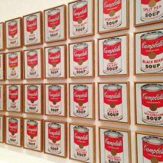
1962 — Andy Warhol, Campbell’s Soup Cans
Often cited as the symbolic starting point of American Pop Art, Campbell’s Soup Cans (1962) marked a decisive break with traditional notions of subject matter and artistic hierarchy. The work consists of 32 canvases, each depicting a different variety of Campbell’s soup, displayed as if on a supermarket shelf.
What made the work radical was not only its imagery, but its logic. Warhol did not elevate the object through painterly transformation; instead, he adopted the neutral language of commercial display. The soup can was not depicted as an object of desire or critique, but as a fact of everyday visual life. This shift established repetition and seriality as central strategies, anticipating the artist’s later engagement with mechanical reproduction and printmaking.
1962 — Andy Warhol, Marilyn Diptych
Produced in the same year, Marilyn Diptych (1962) revealed another dimension of Pop Art: the relationship between celebrity, death and image circulation. Based on a publicity still from the film Niagara (1953), the repeated portrait of Marilyn Monroe oscillates between saturation and decay.
The work’s structure — repetition with variation — mirrors the logic of mass media consumption, where images are endlessly reproduced until their meaning erodes. This conceptual framework would become foundational not only for Warhol’s screenprints, but for Pop Art’s broader engagement with photography, cinema and printed imagery.
1963 — Roy Lichtenstein, Whaam!
With Whaam! (1963), Roy Lichtenstein transformed the visual language of comic strips into a monumental, analytical painting. Derived from a panel published by DC Comics, the work isolates a moment of aerial combat, stripped of narrative context.
By enlarging Ben-Day dots, thick outlines and flat colors, Lichtenstein exposed the mechanics of printed images. Unlike Warhol’s embrace of chance, Whaam! demonstrates total compositional control. Every dot, color separation and line thickness was calculated. The work marks a key moment in Pop Art’s transition from appropriation to formal investigation, where reproduction itself becomes the subject.
1964 — Andy Warhol, Brillo Boxes
Brillo Boxes (1964) pushed Pop Art into philosophical territory. By recreating commercial packaging as sculptural objects, Warhol erased the visual distinction between artwork and commodity. The boxes were nearly indistinguishable from those found in supermarkets, raising questions that would later dominate conceptual art.
The work’s importance lies in its challenge to authorship and originality. Nothing in the object itself signals “art” — its status depends entirely on context and distribution. This logic parallels Warhol’s print practice, where editioned works function as both artworks and circulating images.
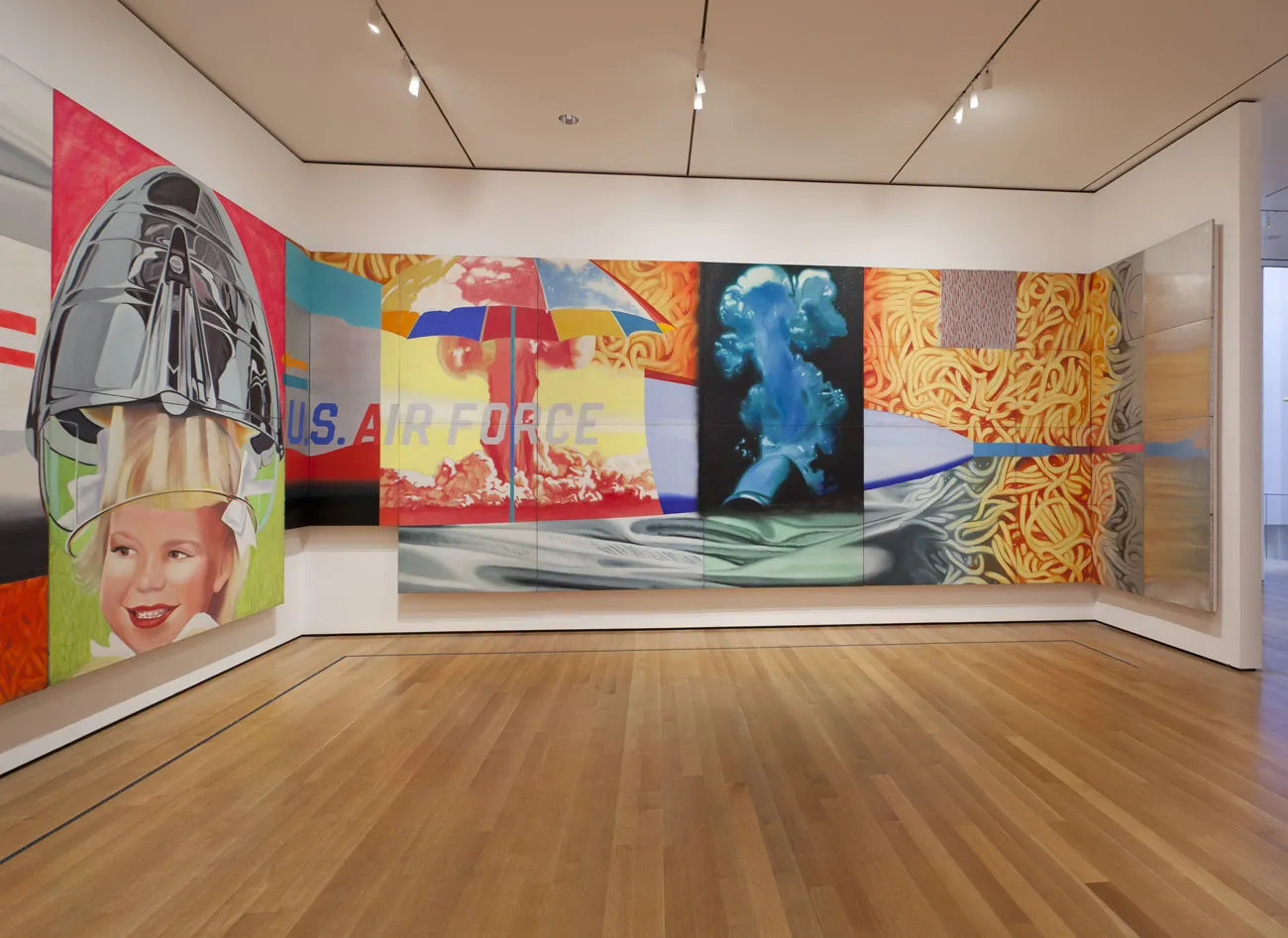
1964–1965 — James Rosenquist, F-111
While often discussed less than Warhol or Lichtenstein, James Rosenquist’s F-111 (1964–65) represents a crucial expansion of Pop Art’s scope. Stretching over 26 meters, the work combines fragments of advertising imagery with the military-industrial symbol of a fighter jet.
Rosenquist, a former billboard painter, applied commercial techniques at architectural scale. F-111 demonstrates how Pop Art could address political and economic systems without abandoning the visual language of mass media. It stands as a turning point where Pop imagery confronts power structures directly.
Late 1970s — Jean-Michel Basquiat, SAMO
By the late 1970s, Pop Art’s legacy had shifted from consumer goods to urban language. Jean-Michel Basquiat’s SAMOgraffiti (1977–1979), created in collaboration with Al Diaz, appeared on the streets of Lower Manhattan as cryptic text-based interventions.
Though stylistically distinct, SAMO inherits Pop Art’s core concern with public visibility and image circulation. The city itself becomes the medium, and authorship remains deliberately unstable. These early works mark a transition from Pop Art’s engagement with mass media to a more confrontational use of public space.
1980–1985 — Keith Haring, Subway Drawings
Keith Haring’s subway drawings, produced primarily between 1980 and 1985, represent the culmination of Pop Art’s movement into direct public communication. Using white chalk on unused advertising panels, Haring created a visual language designed for immediacy and universal legibility.
These works were intentionally ephemeral, resisting commodification while embracing mass exposure. Yet their graphic clarity translated seamlessly into prints, posters and editions, allowing the imagery to circulate globally. Haring’s practice closes the Pop Art timeline by reconnecting image-making with public access and social urgency.
A continuous system of images
From Campbell’s Soup Cans to the subway lines of New York, Pop Art reveals itself as an evolving dialogue between image, medium and distribution. Each work marks a shift in how artists understood reproduction — not as a technical process, but as a cultural force.
Seen together, these pivotal works form a timeline that is less about stylistic consistency and more about expanding visibility. Pop Art did not simply reflect popular culture; it reshaped the conditions under which images acquire meaning, value and permanence.
In this sense, Pop Art remains unresolved. Its questions — about circulation, authorship and saturation — continue to define contemporary visual culture.


Harmonia Gallery, London


